Recent Posts

Showing posts with label illustration. Show all posts

Wednesday, August 20, 2014

Interview with Designer and Illustrator Risa Rodil

Back in May (where has the summer gone?), I featured some of Risa Rodil's work. I loved the playfulness and clear literary fan-girl-ness.


Seriously, her Harry Potter pattern is something I want printed on all of the things.


A 21-year-old designer, illustrator and letterer, Risa is an impressive woman who I can't wait to see more work from. She was kind enough to do a short interview with me for To Be Shelved and I'm happy to share it today.


When did you know that this world of design and illustration was where you wanted to be working?

When I was young, my original dream was to become a dentist. I’m not so artsy back then. I don’t know how to draw, I don’t carry a sketchpad with me and I struggle so much to pair up one color with another. Around 7 years ago, I found these really cool photo manipulations online and I thought to myself, “Wow it’d be so amazing to learn how to do that”. Getting my inspiration from there, I self-studied Photoshop when I was 14 and things just fell into place after that.

I enjoyed the challenge of being able to communicate with people through visual design. Of being able to convince people to watch the same shows I watch and read the same books I read, by doing designs that will make them look twice. And when these people start to notice and acknowledge the hard work you put into each piece, it feels very fulfilling. That was the time I realized that yes, this is something I’m willing to do for the rest of my life.

Keep reading...

 + + +

Thank you, Risa, for taking the time to share some of your life and work with me. I'm excited to see what's next for you!

You can see more of Risa's work on her website or her Behance portfolio. Her blog also keeps you up-to-date on where you can purchase her designs on a variety of items.

p.s. — I'm always looking for designers and illustrators to interview! If you think you or someone you know would be a good fit for To Be Shelved, email me! 

+

an interview with Matt Roeser, before he was a full-time cover designer

if you're looking for a book to read, try this

but first, lemme take a selfie


Monday, July 07, 2014

Sit Inside a Story with Books about Town

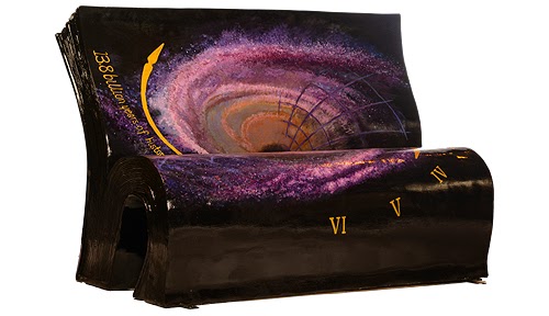
I've never felt a huge pull to visit London but no wait, everything has changed because this is wonderful. The National Literacy Trust and Wild in Art have combined their wonderful powers to fill the streets of London with storybooks.

Or, storybook benches. Which is basically just as nice.


The benches are part of the Books About Town project, which has installed 50 open book bench sculptures around London for the summer. There are four trails the books have been set up along. Visitors can download maps and answer quizzes for each trail.


The full list of the books that inspired each bench, and the artist who created it, can be found on the Books About Town website.


Can you guess what story is being illustrated without checking the list?

In October the benches will be auctioned off, with proceeds benefiting the National Literacy Trust.


If you don't live in London, you can follow Books About Town on Instagram to see behind-the-scenes process work and the installed benches. Also, on Facebook and Twitter.

What a great project. Love seeing things like this pop up around the world.

via Creative Review

+

The magical thing about books...

a book I received for my birthday

My kind of book cover

Friday, July 04, 2014

The Illustrations of Deanna Halsall

Deanna Halsall's illustration style caught my eye when she was featured on Grain Edit earlier this month. I loved one of the pieces they used to showcase her style—a girl reading underneath a spotlight.


Located in the UK, Deanna's work spans the worlds of editorial, advertising and interior work for an impressive list of clients that includes NBC, The British Science Council, Levi's, The Guardian and a handful of alcohol companies (woo!).


A peek at her sketches:


I love this little bit from her website:
Her work stems from a love of nature, birds, beards, pens, nice hair, nostalgia, super mario, screen prints, the colour yellow and collecting old stuff usually found in her parents' attic.
What a great handful of inspiring things. I feel like they're especially apparent in her map work:


See more of Deanna's work on her portfolio site and follow her on Twitter @deannahalsall.

+

Deanna also did work on Think Quarterly, which I've mentioned before

more work from some wonderful illustrators

I love this book collage

Tuesday, July 01, 2014

World Cup Coincidence: Illustrator Yuko Shimizu

Well, this is crazy.

I posted about the new soccer/futbol magazine, Eight By Eight last week. After originally writing about it for Visual News, then posting it here as well, I became pretty familiar with the images. So when I saw this illustration on Pinterest, I thought it was such an intense resemblance to one of the images I had used with my article.


Well, after some, um, zooming in, I figured out it is the same illustrator and that is too cool.


Beautiful work on both pieces by illustrator Yuko Shimizu. The first comes from the DC Comics Vertigo series The Unwritten. 

You can see more of her work at YukoArt.com. Careful, you might get lost in her portfolio for hours.

Friday, June 20, 2014

Leanne Shapton's Covers for Jane Austen Novels

Once again, Leanne Shapton has created simply beautiful work. After finding these covers on Pinterest, I immediately decided I need to own them... despite any desire to ever read any Austen.


Her use of watercolors is pretty inspiring. She always seems to know exactly the right way to illustrate the subject. And she never fails to do something really great with only black and white.


This reminded me so much of her book, Sunday Night Movies. 


Yeah, I'd seriously buy those Austen novels with no intention of reading them. 

Learn more about Sunday Night Movies over on Visual News and see more of Shapton's work on her portfolio.

+

some people always read Austen during the summer. Do you?

illustrated book jackets in similar colors

let's have all the kids review all the books

Wednesday, February 05, 2014

Animal Olympics: A Beautiful Vintage Children's Book

I really love the Olympics. And since I'm homeschooling this year, we're doing our long-term project on the Olympics right now. We're learning a LOT, and I have the venn diagrams to prove it.

Obviously, this means I've been obsessing over all things Olympics-related. Even going so far as to search Etsy for the most spectacularly tacky vintage Olympic goods I can find.

Except then I found this really beautifully illustrated children's book from Estonia about the animal olympics, published in 1968.


I happen to love how each animal is matched up with a certain sport (those giraffes are playing basketball, of course). View the Etsy listing for the book.

Know of any more beautiful Olympic books? Tell me!

+

did you own tons of Golden Books as a kid?

the most lovely Paper Dahls

The Little Book of Heartbreak is the best February read

a little encouragement. because Olympics?

Monday, February 03, 2014

Alex Westgate's Illustrated Book Jackets

I didn't have a thesis project before I graduated, but if I did, I'm pretty sure it would have involved book covers. Obviously.

For his thesis project, illustrator and designer Alex Westgate created book jackets for three novels by S.E. Hinton.


Those colors! Swoon. Reminds me of these vintage Dick and Jane books. Also, I love this photo on Westgate's About page:


See more of Westgate's work on his website, or on Dribble—if that's what you're into.

via DesignWorkLife

Wednesday, January 15, 2014

"The Elements of Style" illustrated by Maira Kalman

I literally just said "HOLD ON!" out loud because I had no idea this book existed and the 10th grade version of me who had an ugly copy of it is super bummed about being too young right now.

Great news, I probably appreciate it more now.

The always amazing Maira Kalman has illustrated Strunk & White's The Elements of Style. Apparently it was published in 2005 and I'm just really behind. Luckily in 2014, it is still worth talking about.


Just lovely.

all images via Maira Kalman

+ 

Charley Harper: An Illustrated Life

What I'm currently reading

these shapes have taken over my sketching

& because pitchers and catcher report in 30 days

Monday, January 21, 2013

By Blood

I get a lot of email newsletters from publishing companies and various book-affiliated places. I should probably open more of them. I can't remember what particular email I opened that led me to "By Blood", but what a beautiful, wonderful thing I found.

Ellen Ullman's latest novel is the story of a professor who overhears the therapy sessions of a young lesbian in search of her adoptive family. The professor takes the quest as his own and sends information to the patient disguised as mail from an adoption agency. This sounds amazing. It just shot to the top of my "To Read" list (Sorry, Nate Silver).

But very obviously what first got my attention was the fantastic cover, not the story it binds.


Really lovely design work by Rodrigo Corral (as usual), with illustration work by Adly Elewa. The two have been working together on a number of other wonderful things, that I'm sure I'll need to feature again on the blog soon.

Plus, another wonderful Rodrigo Corral cover
& a post from exactly two years ago

Tuesday, September 25, 2012

Catcher In the Rye by M.S. Corley

Back in April, I posted about M.S. Corley's contributions to Litographs, which incorporate the entire text of a classic book into a poster. His "Catcher In the Rye" print was a huge hit and now he's released the design as a print, without the words.
You can buy the poster via InPrnt, in two different sizes.

More from M.S. Corley
And remember these Knock Knock bookmarks from a year ago? I still love them.

Monday, July 23, 2012

Book VS Movies - HP

I love this series of illustrations by Robin Tatlow-Lord illustration the difference between the descriptions of Harry Potter characters in J.K. Rowling's books versus how they end up portrayed in the movies.


So funny.

In defense of the movie version (can't believe I just said that) in the first few movies Emma Watson did look quite a bit more like the book Hermione, she just grew-up to be gorgeous.

Hey, never enough Harry Potter.
& more illustrations.

(found via Visual News)

Friday, June 29, 2012

Tess Redburn

Tess Redburn, student at Bath Spa University in England, created this beautiful cover for the Puffin contest to redesign Grimm's Fairy Tales. First, she laser cut her drawings into a piece of wood, then photographed them to create the book cover. I hope the piece of wood is hanging on somebody's wall somewhere because it really is a work of art itself.


Tess says:
I wanted the book to look like a solid piece of wood as an object to relate to the woodland setting of most of the stories.
For more of Tess's work, visit her portfolio or follow her on Tumblr.

Plus, this week To Be Shelved got some Knock Knock love!
& more about Knock Knock.

(found via Creative Review)

Wednesday, May 16, 2012

New Ferocious

More great work from Ferocious Quarterly. And it's all about survival, which really makes me miss camping. 


Here's how it came to be, according to FQ:
"Be Prepared" sent our contributors on their way with one word as a loose token of inspiration: “SURVIVAL.”
The written words in this issue were prepared a little different than usual. Our writers were given preliminary sketches, rough concepts and illegible notes from our contributing illustrators. They concepted their stories in unison with their assigned collaborators—dueling artists, refining a work together until the final pieces were complete. What we’re left with are stories accompanied by illustration and yet inspired first by illustration.
Contributors include to of my favorite illustrators/letterers/people I follow on Twitter and talk about like I know : Dan Cassaro and Erik Marinovich.

And, hello, it comes with a merit badge.


To see a video of issue no. 3, head over to Ferocious. All good things.

Plus, issues 1 & 2.
P.S. use the code "BEPREPARED" to get issue 1 free when you buy all 3!

Friday, March 23, 2012

The Heads of State

Yesterday, I posted about a fun project from one of my favorite design studios, Heads of State. Today I wanted to share a few of the book covers they've worked on.


I really like how simple and clean these designs are, but they aren't boring. The cover for "Seven Pillars of Wisdom" might be my favorite in this batch. I always enjoy when a design for a series like that can fit the series but still stand out, and in this case, still carry a good balance between vintage and modern design.

And that quote at the bottom comes from the little intro statement on their website. The full text reads:

We are a mom & pop design shop. A garage band agency. A start-up that's been around for years. We make posters, books, illustrations, identities, you name it. But most of all we make ideas.

Awesome. Sounds like a studio that would be a pleasure to work with.

Learn more:
More book covers from The Heads of State
The Heads of State studio website

(all images the Heads of State)

Thursday, January 26, 2012

Owen Gatley's World of Books

I love this illustration by Owen Gatley. I have such a weakness for simple maps and this one just happens to be covered in books as well. It is essentially my bedroom decor in a single illustration.


But wait, it gets better, because the illustration was created for the cover of the Pan MacMillan catalogue of new titles for the Autumn/Winter 2011 season.


You may recognize Owen's work from publications like Think Quarterly, which I love, Urban Outfitters and more. All of these lovely illustrations can be viewed over on his very impressive website.

(All images courtesy Owen Gatley / Found via Visual News)

Saturday, November 19, 2011

Higher Gossip

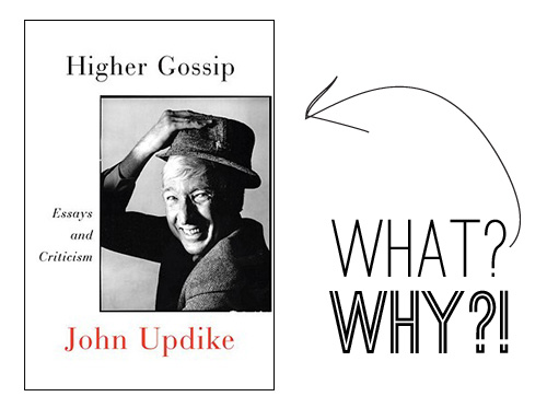
Posthumous publications kind of weird me out, but that doesn't mean I'm not going to read them. For example, I'll always take more John Updike books on my shelf.

But when I saw the cover for "Higher Gossip" I was really hoping it was a rough draft, or something. I'm still holding out for that theory to be true. Sure, I love white space as much as the next girl, but this white space is all wrong. I'm just real confused about what is, and is not, happening here.
So in the meantime, let's think about some good lookin' Updikes: persons and covers.


CLICK HERE to see more posts dedicated to Updike and some of the better covers his work has seen.

(illustration by Josh Cochran for the New York Times)
Related Posts Plugin for WordPress, Blogger...

ShareThis