Recent Posts

Tuesday, March 23, 2010

Horrible Hemingway

One of my assignments for the BG News today was photographing a burrito eating contest where a contestant almost vomited on me.

The experience was almost as disgusting as the book cover I found while seeking sanity at GFT after the contest.

Two words: poor Hemingway.


(front)


(back)

I'm sure the beloved author is rolling in his grave over this one. First of all, the colors. Why so many? Also, I'm sure the early 90s would like their palette back. Second, why does this book have supposed blood spatters on it? Since this is a biography of Hemingway, it seems to infer that he was a murderer. I guess I missed something. I could really go on forever but almost find it unnecessary. Even someone who doesn't have a small obsession with design can see this cover is a disaster.

Unfortunately, the inside pages are just as bad. Click through to the jump to see what I'm talking about.


Monday, March 22, 2010

Trapper Kindle

I blogged last week about how to hide an ugly cover. Today I ran across this great illustration by Lunchbreath about how to cover up a Kindle in order to properly portray your "literary sophistication".


Every inch of this illustration is hysterical. I recommended checking out Lunchbreath's photostream on Flickr, he has some great work.

Thursday, March 18, 2010

Rabbit, Run


A couple of years ago, I was studying abroad in Italy and loving every minute of it. One of my favorite shops in my pseudo-home city of Firenze was Paperback Exchange, a second-hand trade-in English bookshop. Paperback Exchange always had the best bargain boxes, which is where I picked up my tattered copy of John Updike's "Rabbit, Run" for less than a euro. When I chose "Rabbit, Run" as my purchase of the day, I had never heard of the series. Instead, the cover, like all great cover art should, drew me in. It was old, worn and provocative. And after reading the novel, I came to realize and appreciate each element included.


"Rabbit, Run" is the first in a series of four novels about lead character Harry "Rabbit" Angstrom's life, from young-adulthood to death. I have only read the first two ("Rabbit, Run" and "Rabbit Redux") so far, because I can't find a copy of "Rabbit is Rich" that is aesthetically pleasing, but Rabbit is one of my top three favorite literary characters.

During my search for "Rabbit is Rich" I have come across a variety of "Rabbit, Run" covers, but I still like my Italia find the best. I've also found quite a few on GoodReads that are pretty interesting.

CLICK THROUGH to the jump to see more covers and read what I have to say about each one.


Tuesday, March 16, 2010

Have an Ugly Cover? Cover it up!

Sometimes, unfortunately, the book you really want is going to have an ugly cover (like the too-busy front for Diddy's book which is obviously a coveted read). So like a true book lover, you'll breathe in deep, pick it up off the shelf and take it home with you. But I'll warn you: once you've got it on your bedside table that hideous thing is going to haunt you until you place it face-down.

I come bearing good news; there are solutions to these cover design nightmares. An additional book cover can provide a little extra cover-up for an unfortunate design mishap. Luckily, there are more options than the stretchy covers you used on your text books in middle school.

In this post I will concentrate on some of the jacket covers I like best, but there are a lot more out there to be found. I've chosen to highlight the JACKET+BOOKMARK designs by IcoeyeBook City Jackets' Fold-to-Fit products (below) and some pretty-patterned cotton creations I discovered on Etsy.


Click through to the jump to read more about these great designs, or check out this simple book cover creator to design your own.

Sunday, March 14, 2010

The Old-Time Paperback Book Covers Pool from Flickr

This past week I've been on a complete vacation in Seattle: no school, no newspaper and no book blogging. But now I'm back to reality and I'm really excited about some upcoming posts.

This quick update is dedicated to a Flickr pool comprised of vintage paperback book covers. Although many of them are super-cheesy, I have found a few I really enjoy:


"Axe" by Ed McBain 1969
I love how simple this cover is, especially the use of negative space around the photo.

 
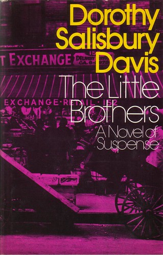
"The Little Brothers" by Dorothy Salisbury Davis 1973
I really like how brightly colored this cover is, as well as the use of type on top of the image.


"Nerve" by Dick Francis 1967
This cover uses bright covers to draw in the potential reader and lets them know a little about the story inside.


To see more vintage paperback covers, check out the pool here.

Friday, March 05, 2010

Cover Compare/Contrast

My roommate and I spent our summer trying to make sure we had 2 copies of most of our books. We came pretty far from our goal, but the books we collected are pretty interesting to compare. Below is a quick slide-show of some of my favorites including "War and Peace", "Our Hearts Were Young and Gay" and "Brave New World".

To view my commentary on the covers, either enter full screen mode or click the slideshow to be taken to my flickr page. I've also included my comments after the jump, simply click "read more" to view them.


Wednesday, March 03, 2010

You Are Not a Gadget

If you follow design work at all and think you've never seen work by Olly Moss, you're probably wrong.

Moss has created a number of illustrations and designs, and his work can be found on apparel at Urban Outfitters, Threadless and more.

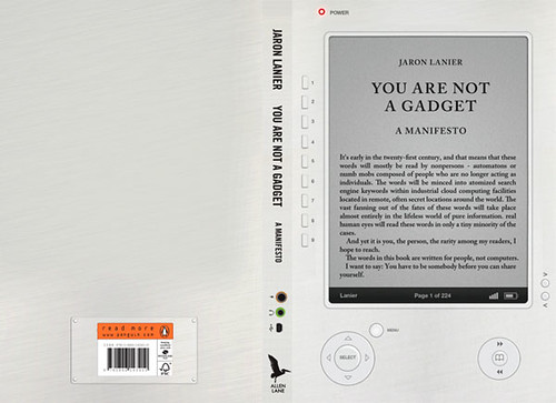
One of my favorite Moss works is his cover design for "You Are Not A Gadget", a technology manifesto written by Jaron Lanier.


I absolutely love the irony of this cover. To design the cover as an electronic reader seems almost obvious, and yet, the original cover was much different.

I am still on the fence about e-readers in general, though. I would personally love if I could use one for my college textbooks but that's about it. I still love the feeling of the weight of a book in my hands, and the sense of accomplishment from physically turning the last page of a great story. I also worry a bit about what e-readers will do to the art of cover design. The situation is obviously out of my hands, so for now I am enjoying watching the trend evolve and still love seeing great print covers like Moss'.

Monday, March 01, 2010

Jim Tierney covers Jules Verne

After my first blog post, my classmate Alex recommended I take a look at Jim Tierney's redesigned covers for Jules Verne's books. I think Tierney's work is absolutely lovely and really fun. In fact, I liked these covers so much I've been putting this entry on hold since reading Alex's comment so I could talk to Tierney about his work.

I contacted Tierney via e-mail, and now I am happy to present a blog entry dedicated to Jim Tierney's Jules Verne covers.


Tierney, a soon-to-be graduate and current illustration student at the University of the Arts in Philadelphia, redesigned the Jules Verne covers for his senior thesis. He created lovely jackets and designed the covers beneath them for "20,000 Leagues Under the Sea", "From the Earth to the Moon", "Around the World in 80 Days" and "Journey to the Center of the Earth".

MORE from my talk to Tierney and a video demonstration of his covers after the jump.

Related Posts Plugin for WordPress, Blogger...

ShareThis