Recent Posts

Showing posts with label flickr. Show all posts

Thursday, April 01, 2010

Books, Movies and Bad Covers

One thing that really upsets me is when a great book is turned into a movie, and after the movie is a big success, the book gets a new cover. Usually, this new cover features the actors from the movie and huge, tacky type proclaiming the movie was a big hit.

For example, Alice Sebold's The Lovely Bones. The original cover featured a charm bracelet, which is an important part of the book's plot. The movie cover looks very similar to the movie poster and is pretty creepy.


Some designers have flipped this method. They've taken some awesome movies and created the book covers they deserve. Most of these are just designs and aren't actually in print, but they are worth checking out and, maybe, drooling over.

One set I love is from blogger Spacesick. He created an entire "I Can Read Movies" series that looks vintage and pretty worn. One of my favorites is for Space Jam.


Also, I love the illustration for Big.


Maybe I'm just a sucker for vintage design and spot color, but I think these are great and I wish I could actually own them. To see more of Spacesick's designs, click here to check out his Flickr.

Have you seen any "fake" book designs that you really enjoyed? Any up-and-coming designers that deserve some attention?

Sunday, March 14, 2010

The Old-Time Paperback Book Covers Pool from Flickr

This past week I've been on a complete vacation in Seattle: no school, no newspaper and no book blogging. But now I'm back to reality and I'm really excited about some upcoming posts.

This quick update is dedicated to a Flickr pool comprised of vintage paperback book covers. Although many of them are super-cheesy, I have found a few I really enjoy:


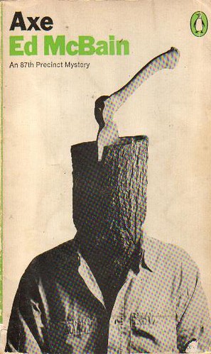
"Axe" by Ed McBain 1969
I love how simple this cover is, especially the use of negative space around the photo.

 
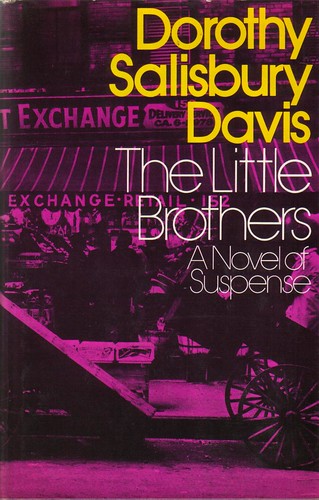
"The Little Brothers" by Dorothy Salisbury Davis 1973
I really like how brightly colored this cover is, as well as the use of type on top of the image.


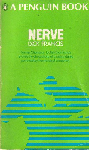
"Nerve" by Dick Francis 1967
This cover uses bright covers to draw in the potential reader and lets them know a little about the story inside.


To see more vintage paperback covers, check out the pool here.

Related Posts Plugin for WordPress, Blogger...

ShareThis